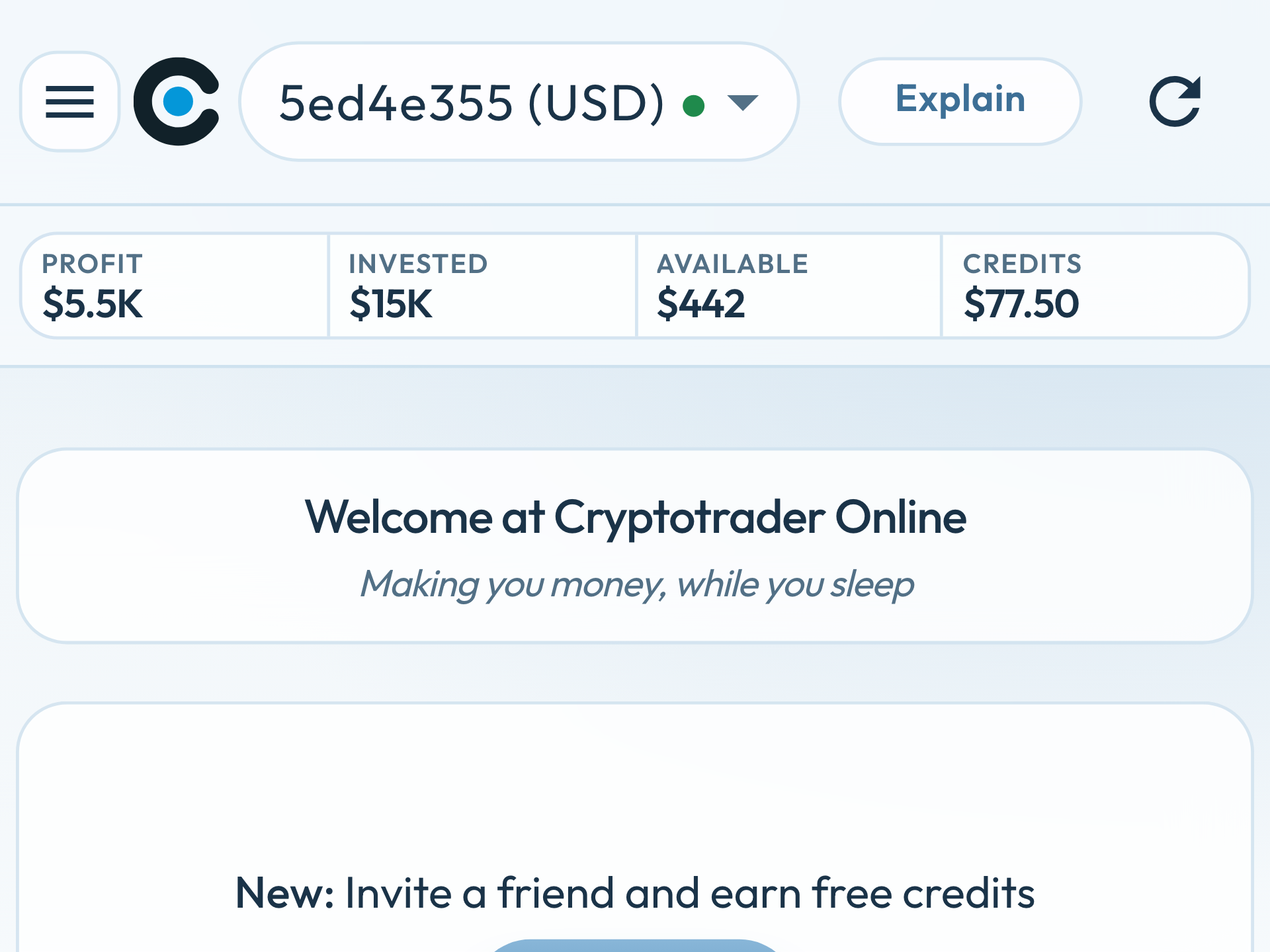
The app already received a new design. That story is in What’s new in the Cryptotrader app. This post is about cryptotrader.online itself.
Homepage: the app, not a slider
The old homepage opened with a cinema slider: large slides, a lot of motion, two buttons. On a phone that slider filled the screen, and the rest of the page only appeared after scrolling.
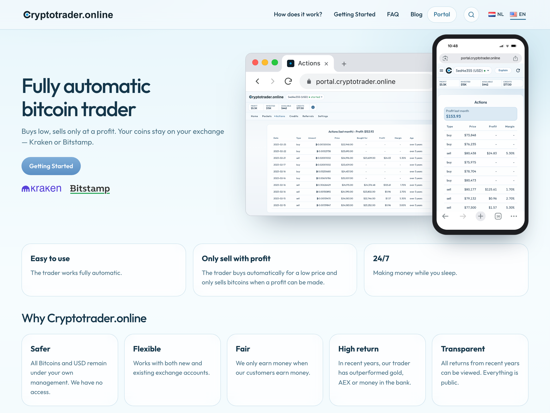
The new homepage shows what Cryptotrader is in one glance. On the left, the explanation and a single button: Getting Started. On the right, the real app — in Chrome on a laptop, and on an iPhone next to it. Below that, Kraken and Bitstamp, and two short points: Sell rule and 24/7 operational.
There is no separate registration button on the homepage any more. Registration belongs with the steps in Getting Started.
Works on your phone
The old site was a desktop layout that collapsed on a small screen. Menu, slider and columns were awkward to use on the go.
The new site is responsive. On your phone the blocks stack cleanly. The menu sits behind a button, with search and the language switch next to it. The homepage copy stays readable; the laptop and phone images scale with the screen.
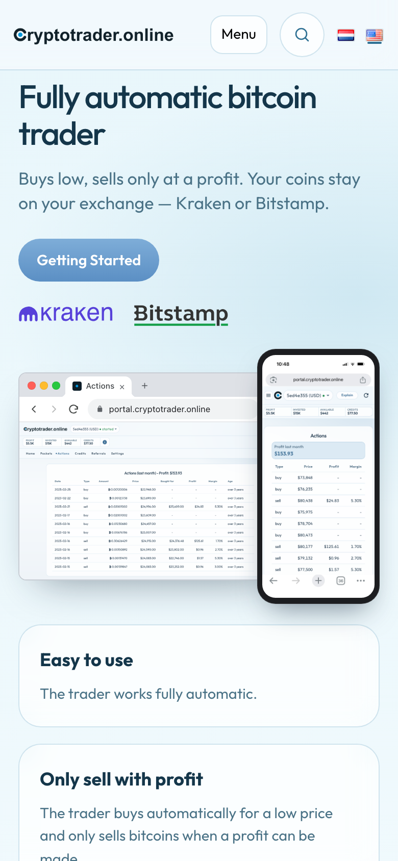
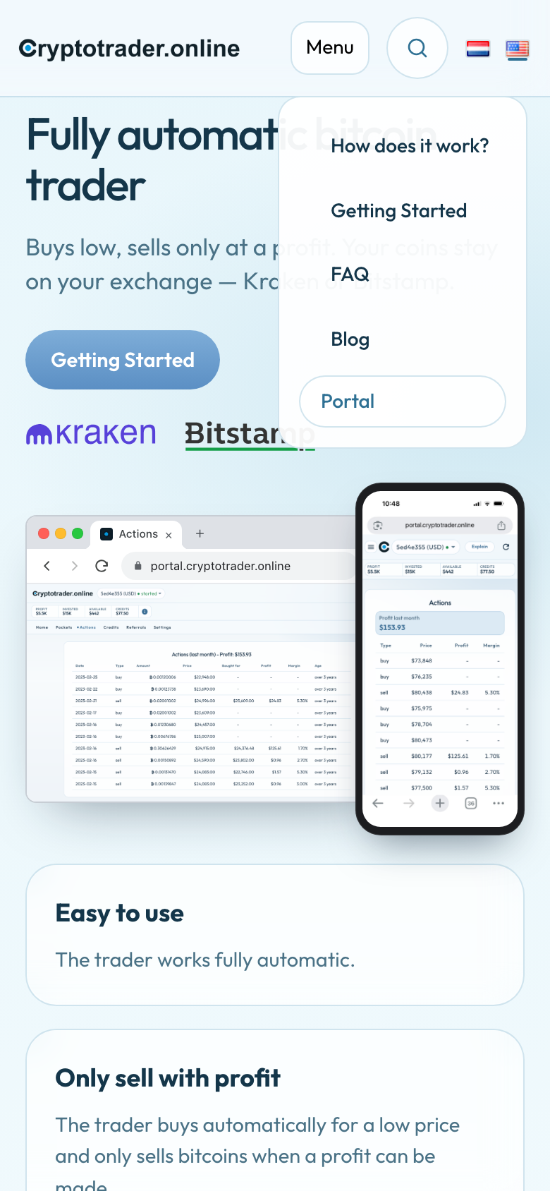
Benefit: you can read the docs, the blog and Getting Started on your phone — without pinching to zoom or scrolling sideways.
Search in articles and pages
The old site had no usable search. If you wanted something about credits, Kraken or missing pockets, you had to click through the menu or the blog.
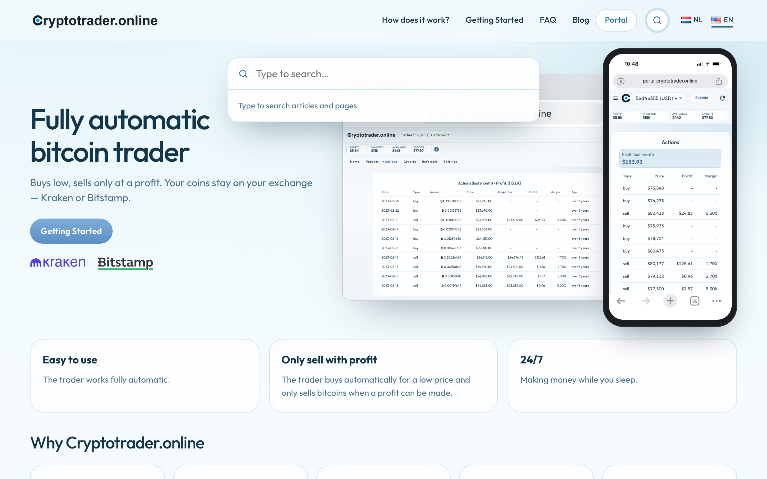
The header now has a search button on the right. You type, and you search articles and pages — in the language of the page you are on.
Blog: featured post, then the rest
The blog was a standard WordPress list. The newest article disappeared among equally sized tiles.
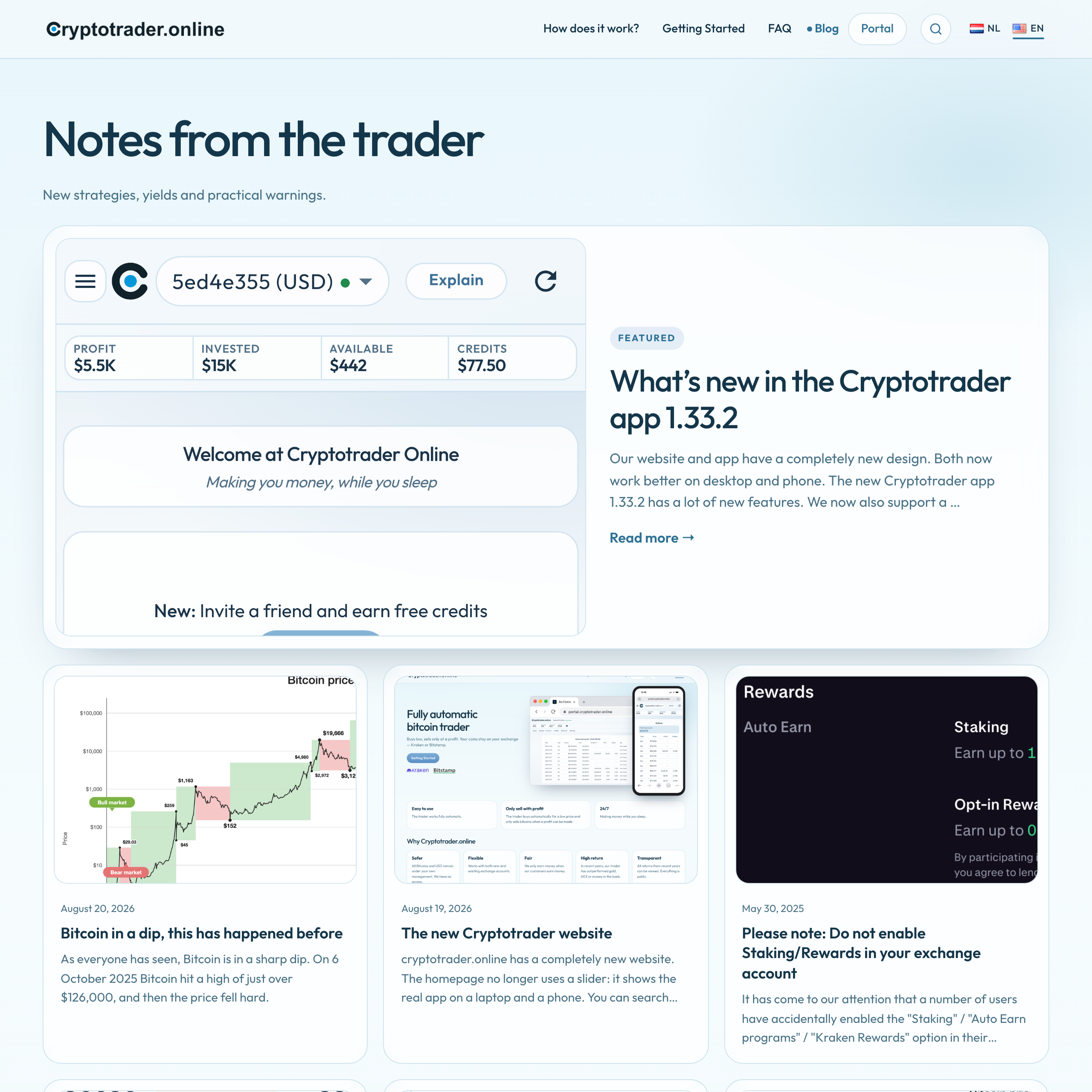
The latest post now sits large at the top (Featured), with a summary and a Read more link. Below that, the other posts in a grid. Under the list, Load more is still there — the same control you already know, so older posts do not vanish.
No WordPress, no database
The old site ran on WordPress. On every visit the server assembled the page again, with a database and extra plugins. That takes time. And it is a well-known target: WordPress plugins regularly get security holes, and anyone who finds the editorial login has an extra door in.
The new website is ready-made HTML files. We build the site in advance. When you open cryptotrader.online, the server sends the file back. No WordPress, no database, nothing that still has to compute on that request.
We build it with Hugo.
Faster. Serving an HTML file is close to the fastest thing a web server can do. No database query, no extra software per visit, no heavy plugin in the background. The page is there immediately — on a laptop and on a phone.
Safer. There is no editorial login on the public site. There is no database of accounts or articles to steal. There are no plugins that turn out to have a hole tomorrow. The site has nothing to “run” except handing out files.
What else got quieter
A few things you mainly notice because they are no longer in the way:
- No moving slider on the homepage — the page loads in one go.
- Fewer buttons in the menu. Portal stays a clear button to the app. Prices, terms and the risk disclaimer live in the footer.
- The NL / EN language switch is still at the top right. Each page has a counterpart in the other language.
In short: the same content, a site you can use on your phone, search when you want to find something again, and HTML that is ready to serve — no WordPress, no database. The app itself lives at portal.cryptotrader.online.
New here? Getting Started